
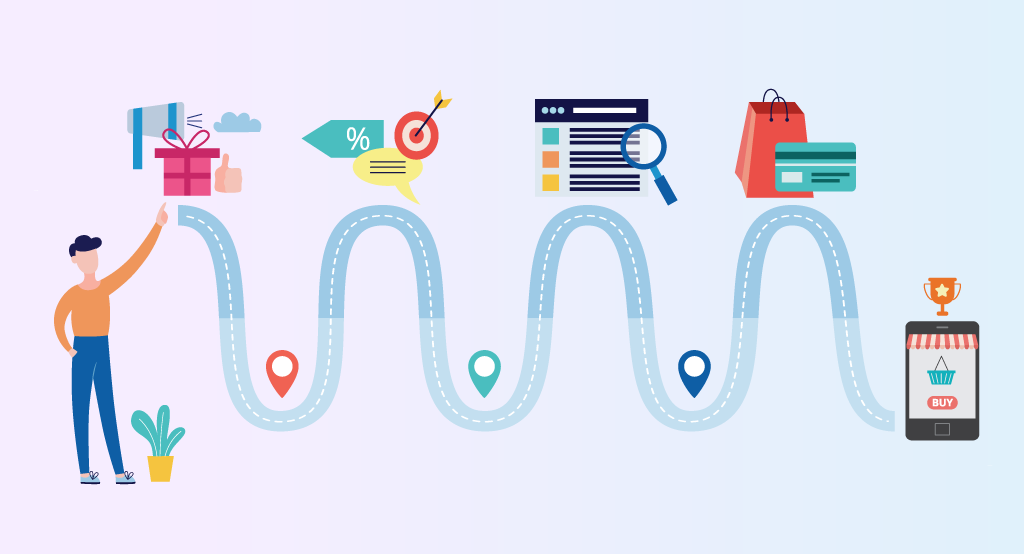
Common User Journey Types
Amazon is usually held up as a beacon for designing great product journeys. Getting from search to checkout is painless. I am out of there inside a couple of minutes. I’d guess that most people know which product they want before even visiting the site.
Other common transactions that have a journey are donations. Here, I want some back story. This might be a short article or video. I also need to see contact information, the organisations charity credentials. Only after I have gained this reassurance will I be prepared to take the next step.
The most difficult and time sapping user journey is search. We need simplicity here. So look at the Google home page, a perfect landing page. One text box and a button. The logo tells you where you are. That’s it!
Key Components Of User Journeys
We need to start our, hopefully brief website journey, with compelling and/or accurate information. In as few words as possible and with relevant images. Everything on the page needs to gently guide the user towards a prominent call to action device. You only need one primary call to action on each page.
The call to action is totally based on your business goals. You want people to complete an action that hopefully leads to a transaction. This might be as simple as inviting someone to join your mailing list. For blogs, the call to action should be positioned at the end of the article.
I’ve now removed the newsletter pop-up window from my own website. I only added it because I fell into the trap of following others. However, most people hate them, I know I do. So I definitely won’t be advising anyone to use full-screen pop-up windows on projects. It really is bad UX.
User Behaviours and Design Patterns
Of course, you need to research the people you want to reach demographically. But there are common human behaviours we might all share. There is scientific evidence that people’s eyes tend to be drawn towards the left side of a web page, when there is more than one column.
It also only makes sense to have two or more columns if your website is like Wikipedia. The content here is less about transactions and more about finding information. The user journeys are frequently repeated and passive. The journey is not about enticement or an emotional experience.
If you sell products, try presenting them visually in threes. This can also work for donations. Giving people three clear options (usually with a recommended one) is amazingly satisfying and easy to follow.
Post Transaction Best Practices
If I have just made a purchase online, then at this point all I need is a polite confirmation page and email. At this stage of my user journey, I want reassurance and a sense of security. I really don’t want to be asked to complete a marketing survey or asked to join a newsletter. I would also rather not have to create an account if I don’t want to.
For me, the ultimate user journey ends when I am left alone. I don’t mind being contacted a couple of weeks later, perhaps asking me for a review. However, it’s better to leave people alone once a transaction is complete. People will return if the service was good.
An important aspect of user journeys is reassurance. This can be provided right from the start of the journey, as helpful facts, such as an FAQ. Social proof is also important, which might include a testimonial.
Make Webforms Easy To Complete
Webforms should only collect the information you need for a particular purpose. There are privacy issues to consider too. Don’t collect information you might want to use for marketing without consent. Forms should also look enticing and easy to complete.